Logo vs Symbol
And does it matter? Throughout the era of branding as we know it there is a constant debate. Is it better to have a logo that is made up of typography and a symbol? A typographic logo? A logo that is purely a symbol? And if your brand launched with a logo that is made with a symbol & typography combined, when, if ever, is it appropriate to drop the type and just stick with the symbol logo to represent your brand?
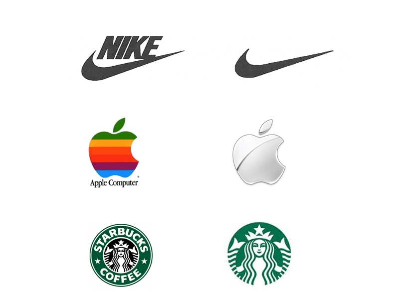
The most famous of these cases is Nike. A brand we all know and love that did drop the word from their logo. But would it have been ok to drop the name and use only the swish before we all loved the brand? Before the brand owned the category of sports? Before the “swoosh” was an iconic part of our culture? Another iconic brand, Apple, evolved through the years to the super sleek and clean symbol that now stands for their brand and all the attributes that go along with it. The most recent high profile case of a popular brand dropping the text element to their identity is Starbucks. You can see the examples below. I think the most important thing is that your brand has personality that is meaningful to world. This done through every touch point, experience and memory anyone has of your brand. The logo is just one part. Once the brand is established in the psyche of the culture, the logo becomes a representation of everything the brand stands for. And whether a logotype, typographic logo or a symbol, if it is simple and well-designed, it will be memorable.


